View Elements
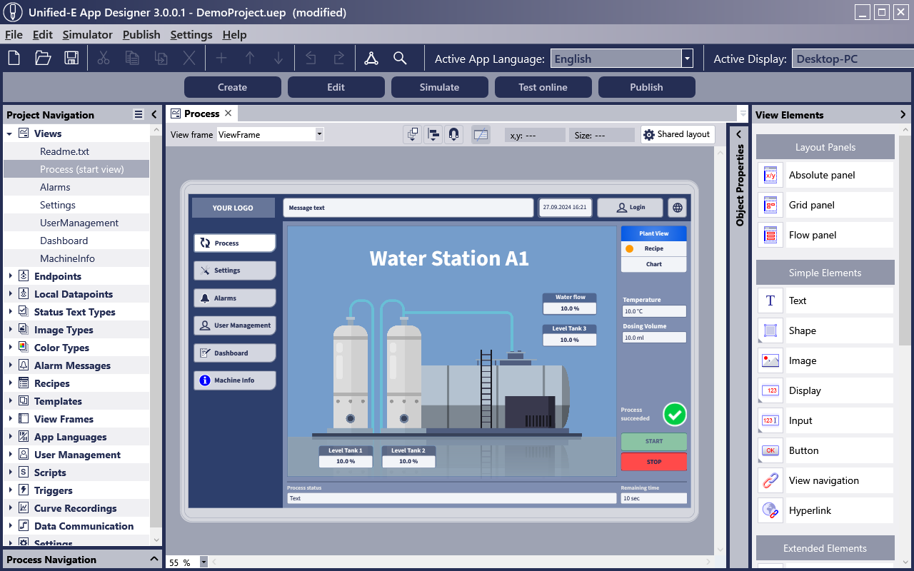
A range of view elements are available in Unified-E for designing an operator interface view. These can be conveniently placed in the desired view position using drag & drop.
In the properties area of the Unified-E App Designer, the view elements can be customized very individually. By linking properties with datapoints, the view elements are brought to life and thus connected to the machine or plant.
All necessary elements for creating modern HMI operator interfaces are provided, e.g., switches, input fields, pie charts, time charts, message tables, language switchers, or even simple elements like geometric shapes or images.

Views for All Display Sizes
The view layout can be optimized for the desired display size. For a pure smartphone display, the fluid layout is suitable, where the view width adapts to the display width.
For plant images, the absolute layout with free placement of elements is very suitable. On small devices like smartphones, scrollbars or an input lock may appear, which must be explicitly unlocked to avoid incorrect operations while scrolling.
Diverse Graphic Design Options
View elements can be very individually designed using numerous properties. Images can be easily added to the project from a PNG/JPG or even SVG file.
Background areas can be filled with a gradient, and texts can be adjusted in font and font size. All fonts and images are embedded in the project file, allowing for easy backup or bundled transfer of the current HMI engineering status.

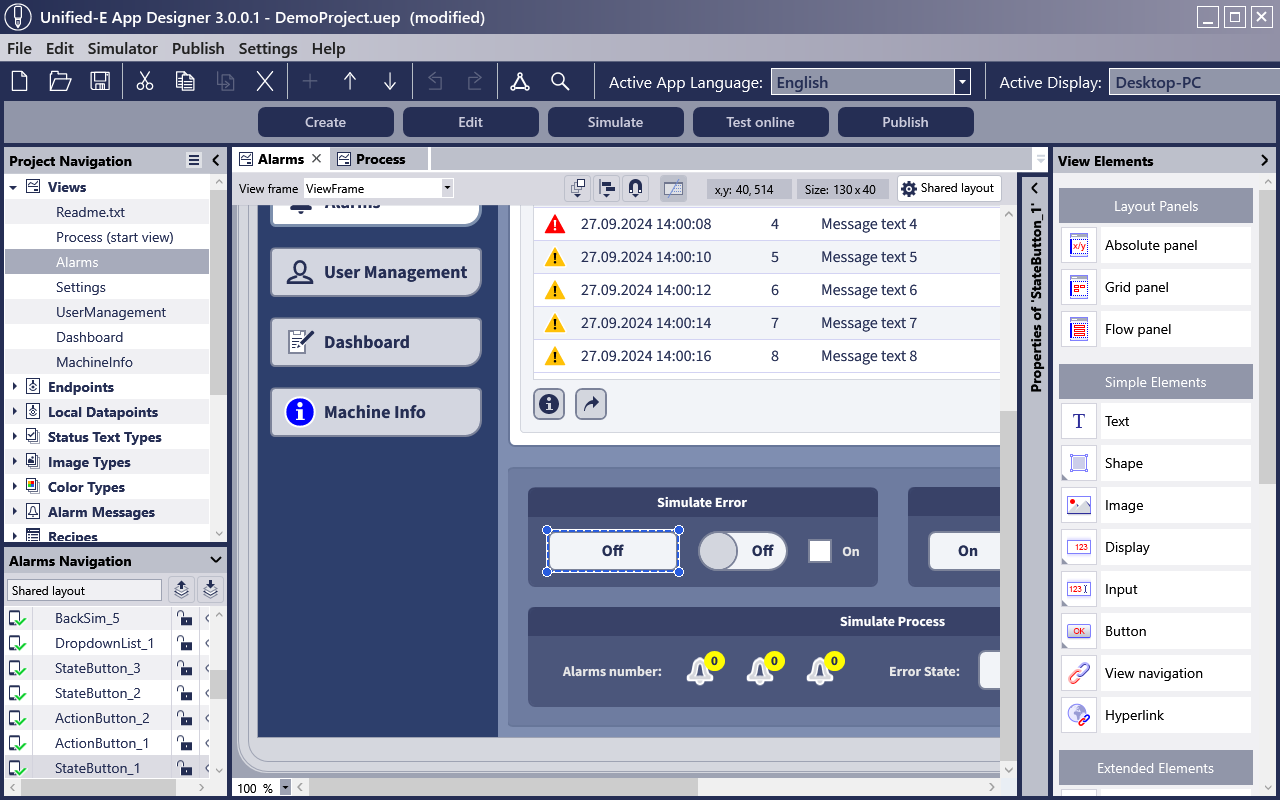
The Unified-E App Designer as a graphical editor offers numerous functions for efficient handling. Guidelines can be defined, and new elements can be automatically aligned with existing elements during drag & drop. Elements and areas can be locked or hidden in the editor to work efficiently with multiple layers. The zoom function helps to keep an overview on large HMI displays.
View elements can be grouped and summarized in panel containers to maintain an overview and simplify handling during engineering.
Dynamic Configuration with Types
There is often a desire to visualize the plant status with a specific image, text, or background color. The PLC programmer often defines the interface (public variables) for control "technologically" without knowing the exact details of the HMI visualization. The HMI designer then decides which text should appear for which states (e.g., numerical values). For this purpose, color types, image types, and status text types were introduced in Unified-E.
Based on a type (color type, image type, or status text type) and a datapoint for value provision, the display of the view elements can be dynamically configured with Unified-E.
Advantage through Reuse
As a project engineer, you don't like to duplicate complex view areas or elaborately configured view elements so that you don't have to maintain both the original and the copies later on. Similar areas should ideally be defined only once and configured via an interface if a variation is required.
To avoid duplication and tedious routine work, the Unified-E App Designer offers the following functions:
- Templates:
A template is a kind of predefined area that you create and can then instantiate as often as you like. In the template, datapoint links can be defined as "parameters" so that they only need to be set at the instance. - View Frames:
Most HMI operator apps have a common header and a common navigation area for all views. In the view frame, you can define where the view should appear on the display. In the remaining area, you can configure the header or a navigation bar, for example. By the way, Unified-E also allows two-stage navigation with the "View Navigation" element, for example, a bar for primary selection could appear on the left, and a secondary selection could appear in the footer depending on the primary selection. - Display Templates:
If properties of a view element are not explicitly configured, the properties of the display template are adopted. For example, if you want to uniformly change the radius of the corners for action buttons, you only need to adjust the radius property in the display template once. All action buttons without individual frame configuration will then automatically adapt to the change from the display template.